Create and duplicate objects and place them perfectly! Set up your patches instantly!
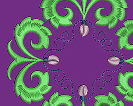
Create mirror images of any object and then position it anywhere you like.
Use Mirror-Merge to flip an object horizontally and vertically or mirror objects on an axis that you draw. Mirror-Merge puts the new object on the same angle as, and distance from, that axis. Reflection tools automatically create reflecting borders and wrap reflections around a center point to create wreath or kaleidoscope effects.
Mirror-Merge is also a great tool for creating multiple copies of a repeating design like a badge. Just specify the number or rows and columns, and EmbroideryStudio e4 creates them instantly.
Take Your List right from the email, copy it to your Team name list, and you are ready to Go!
Personalize team and corporate logos quickly and efficiently
EmbroideryStudio Team Names Advanced lets you take a single design, and then personalize it with names from a list: basically the same way word processing programs handle form letters. One file contains the logo. Another file contains the list of names. Team Names Advanced puts them together ready for stitching.
Save any layout you create as a Team Layout: reusing a layout with different logos and lettering making design simpler and faster. You will cut hours off production time and costs too especially for badges and emblems. Team Names Matrix will lay out all your names as a matrix, eliminating multiple color changes and manual frame movements on the embroidery machine.
The Easy Way to Outline the most complicated Objects
Creates automatic outlines and offset borders
Borders can be any combination of 10 object types
Multiple offsets each with its own independent object type, color, size and more
Offsets Advanced gives you more power and creative options for highlighting and adding outlines and offset borders to your customer’s designs. This tool wraps borders precisely around the shape of any closed object, group of objects, or the entire design. In one action, you can create an outline, and multiple offset borders, each with their own offset, stitch effect, size and thread color. Edit each of them individually.Choose border object types from Run, Triple Run, Input C (satin), Backstitch, Motif Run, Stem Stitch, Vector, Fusion Fill, Complex Fill (satin), and Complex Fill (tatami). Choose between several different methods of handling overlapping shapes for special cases.
Compatible Software: E4 Decorating and E4 Designing
All of us have that one design that is a pain to run, but the customer is a good one, so you endure the thread breaks, and the card board look.. We are going to take a couple of your worst nightmares apart and make them a dream to run.
You will see the design as stitched, and as it appears on the screen. Then you will see what to do to make it stitch as well as it looks!
Use your basic stitches to create the illusion of a fully shaded link of chain or section of rope. Define each section or link without outlining it. It is so easy you will be looking for more ways to use it!
Let's start with the Essentials. It is essential to understand the basics. To understand the process. Learn how to take what you know the machine will do, and use it as your "Rule Book". Work with the machine...NOT against it!
You can add interest by making the background fill an embossed version of the logo. Here, Wilcom’s Program Split was used with the logo to add texture to a plain background.
Let’s say you just finished an embroidery job — a left-chest logo stitched on shirts and hats — and now the customer wants jackets. What’s more, he wants the same logo on a jacket back.
As it stands, the logo measures 3.5 inches wide, but now must be 17 inches wide. To top it all off, the customer wants the finished jacket “yesterday.”
If you anticipated such an upsell, you will be fine. If not, you may have to redigitize the logo because it can’t be enlarged without distortion, overly long stitches and loss of quality. You must change stitch types — column stitches must become fills, run stitches must become columns and fills will need additional underlays and pull compensation.
Changing Stitch Types & Lengths The easiest thing to do is initially digitize your designs so that they can instantly be adjusted to meet any need or size requirement. If you have not digitized expecting an upsell, running stitches — used as an outline — must be changed to column stitches. Most embroidery software includes automatic features that will allow you to click on a group of stitches and change them to suit a larger design. Then, you can widen or shrink that column to fit. Make sure any underlying fill has an edge-run underlay, and remember that the column stitches must be offset enough to catch the underlay so that the new outline does not pull away.
In resizing a design to be embroidered on a jacket back, the existing column stitches in the smaller version must be longer in the larger version. But if they are too long, such stitches easily can be changed to fills and can glisten just like a traditional column stitch; the secret is stitch length. Long stitches that would pull in a larger column-stitch letter can be used in the fill and be stable.
The arbitrary needle penetrations allow you to use longer stitches to create the sheen you need without the stitches pulling out, and that sheen will follow the contour of the letters. So for the larger columns created by scaling up the design, think fill rather than split satin stitches.
Adjusting Underlay Background fills, when programmed the traditional way, will be distorted when you increase the design’s size unless you add underlay and address the additional pull compensation. The longer stitch in the resized fill will pull more than the shorter one in the original fill or tatami stitch.
Additional underlay must be used, usually a double tatami that is set 90 degrees unto itself, to form a lattice that holds the fill in place and prevents it from pulling away from any outline or other object in the design. The fill still must be enlarged to compensate for the pull that occurs because of its traditional settings.
If, on the other hand, you program a layered fill from the beginning, there will be no need for the additional underlay — or any compensation — because there will be no pull. This will lower your stitch count by about 30%, and save you the frustration of thread breaks and a cardboard-like appearance.
To do a layered fill, simply reduce the stitches to 1⁄3 of the density, or the amount used in the first underlay. To reach that exact density setting, determine the number of stitches that a full density fill or tatami object contains. For example, if it contains 15,000 stitches, the layered fill should contain 5,000 stitches. Upon reducing the stitch count, remember the density setting for future use.
Digitize the background fill using the new density setting. Make sure the stitch angle is zero, or horizontal. The object should start at the top and end at the bottom. Then, duplicate that object twice. Alternate the start and stop positions in the second layer by starting at the bottom and stopping at the top, then add an edge-run underlay to that layer. The final layer will start where the second layer ended — at the top — and end at the bottom.
If there is an outline on this fill, add an edge-run underlay to the second layer and offset the column stitch outline so that it overlaps the fill’s underlay. This will prevent the outline from pulling away from the fill.
This layered fill will run beautifully with no thread breaks, and can be increased or decreased in size as needed. It also will result in a fill that moves with the jacket, easily accepts detail and doesn’t cause any push or pull. Furthermore, because there is no need for compensation, there also will be no distortion.
Texture Adds Interest When working with a larger design, certain elements can be added to spark interest. The background fill does not have to be plain; rather, it can be an embossed version of your client’s logo. If you do this, add texture only to the last of the three layers. These extras can add appeal to your designs that brings your customers back.
The last layer of the fill is what your eye will see, so that’s where you can add either a longer stitch for gloss, a shorter stitch for a matte finish, a patterned fill with your customer’s embossed logo or any other appropriate texture.
Easily adjusting a design’s size will enable you to upsell jobs more effectively. Taking advantage of the jackets now available on the market will increase your shop’s bottom line. Starting with a layered fill will make it easier to move from size to size and garment to garment.
Knowing that the layered fill is an option means you can use the original fill from the smaller designs, reduce its density, duplicate it three times, change the starting and stopping positions on the second layer, and instantly avoid the problems related to additional underlay and pull compensation.
These easy steps will ensure you can take advantage of the smaller designs you may have previously stitched, while adding to your shop’s bottom line with a jacket to match. Digitized correctly, such designs will be a pleasure to embroider and even can be your main marketing tool for attracting more customers.
Lee Caroselli-Barnes, owner of Balboa Threadworks Embroidery Design, is known for her innovation and excellence in embroidery digitizing. She has more than 30 years of experience in the embroidery industry. For more information or to comment on this article, email Lee at balboainfo@aol.com.
Not just a Tour, a Digitizing Class Using E4! See how Wilcom's E4 features can help with your digitizing. A 90 minute look at the new features, and the tried and true.
Those that you have grown to love in Wilcom!
See new ways to Digitize on E4! Learn Techniques that will allow you to Digitize and Edit with Ease. Make your Digitizing fun and rewarding! Create designs that bring your customers back and make production a breeze!
Visually stunning new stitch type for added creativity
Create outline or filled shapes with overlapping ‘string art’ stitching for decorative effects. This stitch is also used to attach mirror pieces commonly known as ‘Paghadi’ in India.
Create impressive new artistic and practical stitch effects
Attach mirrors typically used in Indian fashion designs (Paghadi)
Outline stitch type for open or closed outlines
Fill stitch type for filling closed shapes with or without holes
New One On One Personal Classes using Your software on Your computer. We will teach you techniques that will give you instant answers to your problems, and you will be practicing those techniques in real time, with real help!
Great Class...Sorry you missed it. Purchase our Learn to Digitize videos to get a head start on what you will learn!
Next year...Visit beautiful Plam Springs and take part in our live classes!
Get a good foundation, with answers to Small Lettering, Underlay and Push Pull and how to Blend and Shade! Three full days of Classes where you will LEARN BALBOA'S SECRETS.
Great Class...Sorry you missed it!
Purchase our Learn to Digitize videos to get a head start on what you will learn! Next year plan to attend the live classes!
Master Digitizing, from FUNDAMENTALS to the most intricate parts of Embroidery!. Three Day Classes with Labs with one on one instruction. Put it on your wish list for next Year!
Digitize to work with your embroidery machine rather than using compensations or corrections that have been built into digitizing software programs.
June 25, 2013
By Lee Caroselli-Barnes, Contributing Writer
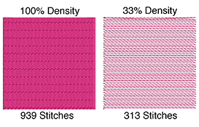
When building layers, start with a 1⁄3 density fill. In this example, a square inch of fill contains 939 stitches, which means your light density fill should contain 313 stitches.
There are two great mysteries that digitizers must solve to build the perfect design: underlay and push-pull compensation. The greatest of those mysteries is push-pull compensation. Once solved, the second mystery, underlay, will fall into place.
Let’s talk about compensation. Webster’s Unabridged Dictionary defines the word “compensate” in the following manner: “to counter balance, to offset, to make up for or to adjust.” I think it is easiest to define compensation as “correction.” I also think that, as professionals, we should work toward not having to correct our designs.
Let’s start with some insight into push-pull compensation. The fact that stitches tend to pull in while pushing out has been at the heart of costly industry research. The compensations or corrections have been built into all of our digitizing software programs. However, with all the money spent on correcting the problem through compensation, very little has been spent on analyzing what causes it and how to digitize in such a way that it does not occur.
Of the adjustments or corrections available in software programs, some are good and some are bad. However, all are confusing, none are 100% effective and none give you the ideal design. Most corrections suggest heavy underlays that hold the garment in place, or purposely distorting the design so it will pull in on the sides just enough to push out at the top to perfectly fill the area. Learning the correct underlay and formula for the distortion is confusing and close to impossible. If you are lucky, the corrections will work. Sometimes.
But what happens to the fabric as it is pulled in? Have you ever pulled material in at a 45-degree angle? The material stretches, so it becomes compact and tends to pucker. The resulting product — with stitches compacting, underlying material pulled in and heavy underlay included — is a heavy patch of color with thread packed in so tightly that it distorts anything on top and does not look like part of the garment.
Think how easy it would be if there were no push-pull phenomenon that needed compensation. How nice would it be to look at the image on the screen and know that is what you will get in your sewout. Without the distortion, you will see any flaw that you may have made — and any flaw you see can be corrected before you stitch the design.
This means, as a professional digitizer, you will only have to proof your design once, not several times. You won’t have to tweak it, stitch it out and tweak it again.
THE PERFECT DESIGN
Let’s take the traditional formula that we have examined and its push-pull problems, and replace it with one that is easy to understand, makes sense and will give you results you can count on.
The perfect design should move with the garment, be subtle and pliable, and look like it is part of the garment. Ideally, we must add detail or stitches on top of the fill patterns without interference from the underlying stitches. The finished design should work on all fabrics without making drastic changes, and scale up and down easily. It should run well with no thread breaks, and it should have just enough stitches to cover the material and give it the true and consistent color that is prescribed.
Our background fills (or tatamis) should be just that — backgrounds. They should work as a platform to show off and enhance the important detail. You should be able to lay the background stitches down in such a way that anything may be placed on top with no interference. To do all of this, we cannot use the standard pull compensation formulas. We need to address the direction, density and length of the stitches, as well as underlay.
When you try to control your machine through compensating, the heavy stitches applied to your material fight for room on the garment. Instead of correcting the problem, they are, in fact, causing it.
However, if you place a light density fill on the garment as an underlay, it will not pull in, nor will it push out. If you add a second layer, it also will not pull in. A third layer, again, will not add to the stitches in such a way as to distort your image and will not pull in. So if you layer your fills instead of putting all of the stitches down at once, you will find that there is no pulling, pushing or distortion, yet you still will have full coverage.
BUILDING THE LAYERS
To build layers, we will start with a 1⁄3 density fill, the same fill that we used for our blending and shading techniques (see March and April/May 2013 issues of Impressions). Start by creating a square inch of fill. Make sure no underlay is present. With a stitch length of about 3.5 or .35, depending on your software, and the density at default, my computer tells me 1 square inch contains 939 stitches. One-third of that density is about 300 stitches per inch.
Check the density setting on your computer when you reach 1⁄3 of the stitches. This is the density you will use when layering objects in your design.
That 33% density is not much heavier than an underlay. And, as we found with the blending technique, by running the layers in the same direction (the same angle) they will blend together and your stitches will not fight for room.
Because you cannot physically put a stitch on top of another stitch, the needle finds the void in the underlying layer and places the new stitch in the open area. As you add each layer of your fill, the stitches will be placed by the embroidery machine in such a way that they fall naturally in place. Thus, you will not be fighting the machine; instead, you will be working with it.
Create a circle with this light density fill. Your stitches will start at the top, go horizontally and finish at the bottom. If you then take a running stitch and outline the circle, you will see that there is no distortion when you stitch out the design. The fill will line up with that running stitch outline.
Using the original circle, create a second circle of the fill pattern by duplicating the first layer of fill. Add an edge-walk underlay or a running stitch outline under the second layer, and stitch that on top of the first layer. There still will be no pull, pushing or distortion.
As this second layer is an exact duplication of the first, move your start point to the bottom where you finished your first layer, then move your stop to the top.
After putting down two layers that add up to a little more than 65% density on your garment, you may add a final layer by duplicating that first layer again and adding it on top of the first two layers. Now, with three layers and 100% coverage, you have a perfect circle. It is one that looks like a circle on your screen, and one that will stitch out as a circle on your machine.
You will have no distortion or thread breaks, and you will have room to add lettering and detail. Also, the image will drape with the fabric and you will have the perfect design — one that can be scaled easily and works on almost every kind of fabric. It is one that needs only the simple running stitch as an underlay to keep its edges clean, and one that has not built in a “correction.”
By using enough stitches to give you full coverage and laying them down gradually, there is no torque or pulling and very little need for underlay. Also by placing one light layer, then adding a second and a third, you will find that even in a light density fill, the needle of your machine will be deflected to a void area and will not place a stitch on top of a stitch.
This is a simple exercise to try, and an answer to the problem of push-pull compensation and underlay. This technique does not leave your resulting design to chance or luck. You are working with the machine; you are not trying to force the machine to do something that it physically will not do. By doing this, you will find you are successful 100% of the time and that your sewout is not only attractive, but also runs well. As an added bonus, you now have created the structure that will hold your column stitch or satin stitch in place if you are adding it to your circle.
Lee Caroselli-Barnes, owner of Balboa Threadworks Embroidery Design, is known for her innovation and excellence in embroidery digitizing. She has 30 years of experience in the embroidery industry. For more information or to comment on this article, email Lee at lee@balboastitch.net.
Getting a realistic 3-D embroidered image requires understanding the physics of art, which is the basis of the interplay between color blending and shading.
By Lee Caroselli-Barnes, Contributing Writer
Green has been added, starting with a lighter green that allows the maroon layers to show through the light fill. Where we wanted a pure shade of that color, a second layer was added to increase density.
Although the terms “blending” and “shading” often are interchanged, there is a difference. You can blend colors without shading, but you cannot shade an object without blending colors. Last month, I provided information on blending with thread (see “The Art of Successful Color Blending,” March 2013). Let’s go a step further by looking at the blending technique and applying it to shading an object.
Similar to blending, shading involves moving gradually from one color to another, which means use of the color wheel is required. Through our application of stitches, we also will address the physical properties that govern our art. For example, you cannot put a stitch on top of another stitch. When placed on top of each other, two groups of fill stitches going in the same direction will blend.
We will again use the light density fill that we used for blending in last month’s article. You will lighten your density to one-third of the default value. For example, if you have 1,500 stitches in a square inch of fill, you will reduce that amount to 500 stitches. By placing three layers of that fill in the same area, you will have 100% density. By having the fills run at the same angle, preferably horizontally, you can blend colors and shade objects.
Let’s look at two different colored objects and examine the shading process used with both.
BLACK & WHITE SHADING
In blending, the transition from dark to light gives objects realism and depth. Darker colors recede, while lighter colors appear to come forward. Therefore, when shading objects, you will use darker colors around the outside and lighter colors in the center.
Looking at the sphere in Figure 1 (see attached photo gallery), you will see the very dark colors — or shadows — around the edge and the very light colors — or full light — in the center. Between the two are halftones, a mixture of the light and the dark colors, and a gradual transition between the colors used. Also, notice there is a slight difference in the amount of the dark color on the top of the sphere than on the bottom. This is determined by where the light hits the object.
For the same effect using thread, you must blend light and dark colors, while adding a third color to show a gradual transition. Start with a darker thread color on the outer edges of the circle. Place one layer of the light density fill in the darkest area, then do a second layer that covers the first layer and extends into the lighter center. Then, outline the whole sphere (Figure 2).
Next, choose a cool shade of gray (preferably blue-gray since you are using black, not dark brown). Choose the area where you see the most intense coverage of that color. Put one layer of the light density gray fill down starting on its right edge of where it is most intense, extending it to the edge of the second layer of black (Figure 3), then add a second layer of gray, extending it to cover both layers of black and extending into the center of the sphere (Figure 4).
Concentrate on the lightest area of the sphere. As with the other two colors, place a light density fill over the most intense area of the white so that it barely touches the edge of the medium gray and extends to the edge of the circle (Figure 5). Next, add a second layer of the light density white fill. This time, cover the original area of white and extend the new group of stitches to the edge of the first gray layer (Figure 6).
Lastly, cover both layers of white, this time extending the fill to the edge of the underlying black layer. Turn off your gray fills in order to see the edge of the black (Figure 7). You will now have three layers of the 30% fill covering the sphere.
FULL-COLOR SHADING
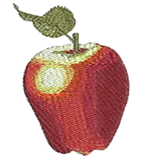
Now, let’s examine how to shade a fully colored object. A three-dimensional apple is a perfect example because it will strengthen what you learned in shading the sphere.
A dark red shade is used to define the edges of the apple, while a lighter shade is used to bring the center of the apple forward. And, because the apple is a hard shiny object, the contrast goes from very dark to very light, with bright patches of white where the light hits it.
The color wheel contains a progression from red to yellow (“warm” colors) on one side and a progression from blue to purple (“cool” colors) on the other side. For the apple, when we select the shade of thread to define the outside, we will use maroon, a color that combines red with one of our cool colors, blue. For the warm colors in the center of the apple, we will use orange, the warm shade of red.
In Figure 8, notice how we outline the apple with maroon, then build the layers by covering the more intense areas of maroon first. Then, we go back and extend the color into the center.
Also, notice there is less maroon on the right side of the apple than on the left. This is because the brighter side is getting the most light. Seeing the direction of the light will help you to anticipate where to place your colors, as well as the amount of each color to use.
Also, you can see that we have extended maroon up into the stem and leaf. Later, we will place green over the maroon, which will give the illusion of brown and help define the center of the leaf.
The next color in the apple is red. This covers part of the maroon as you sew the first layer, then extends to the edge with the second layer. You also will extend this color into the center of the apple, while leaving room for the orange layer that will be placed on top of the red to give it the warm cast. (Figure 9)
In Figure 10, orange and light yellow highlights have been added, with just a touch of white on top. You may be wondering why the light yellow was chosen. This was because we needed a gradual transition from orange to white.
In Figure 11, green has been added, starting with a lighter green that allows the maroon layers to show through the light fill. Where we wanted a pure shade of that color, a second layer was added to increase density.
A darker green also is added for definition and to enhance shading with only one layer of the light fill. Here, a running stitch is used to give the leaf detail. You can see it more clearly by applying the running stitch at an angle opposite the underlying fill stitches. If they had been applied at the same angle as the underlying fill, they would sink in, be virtually unseen and, in fact, blend. There is a light layer of the original red that blends the body of the apple together.
To clean up the edges, a single line of maroon stitching is used around the entire apple. This can be a duplication of the initial outline. You will find, once again, that there is no distortion when you layer your design with this light density fill. That final running stitch outline will line up perfectly.
In the next issue, I will examine push, pull and compensation. Remember that our art is governed, in part, by physics. With blending and shading, we have used artistic principles successfully combined with physical laws. Machines will do the same things repeatedly with stitches, whether we like it or not. Learning to work with the physics of the machines will ensure a successful product with each sew out and allow us to beautifully execute shaded designs.
Lee Caroselli-Barnes, owner of Balboa Threadworks Embroidery Design, is known for her innovation and excellence in embroidery digitizing. She has 30 years of experience in the embroidery industry. For more information or to comment on this article, email Lee at lee@balboastitch.net.
 Create and duplicate objects and place them perfectly! Set up your patches instantly!